By Samuel Trachtman
Liberal-leaning states governed by Democrats have faced criticism in recent years for their high cost of living. Yet, we are unaware of analysis that digs into the extent to which blue states are truly less affordable than red and purple states, to what extent, and why.
This is important to understand. Unaffordability is driving out-migration from blue states to more affordable parts of the country.1 Cost-of-living was the principal concern for voters in 2024 elections, with inflation concerns driving Republican votes.2 Republicans made significant gains between 2020 and 2024 in major states and cities governed by Democrats.3
The blue state affordability challenge is real. Our analysis suggests:
- Blue states tend to have significantly higher cost-of-living than purple and red states, a pattern that has been consistent for the past 15 years.
- Housing is the principal driver of the red-blue cost-of-living divide (with utilities playing a more modest role).
- A combination of high demand for housing and restrictions on supply that lead to shortage drive high housing costs in blue states.
The red-blue cost-of-living divide
The best source of data we have on the relative cost-of-living in different states comes from Regional Price Parities (RPP) data, produced by the U.S. Bureau of Economic Analysis (BEA). Each year the national average price level is set to 100, and the RPP in a given state or metro area provides the price level relative to the national average. So an overall RPP of, say, 115, indicates costs 15% higher than the national average.4
What does the RPP say about the differences in living costs between states with different political leanings? For this analysis, we categorize states as “blue” if they voted for the Democrat in each presidential election from 2008 through 2024, “red” if they voted Republican in each of these elections, and “purple” if they went for different parties in different elections. We should note also that blue states tend to be governed by Democrats in Governors’ offices and state legislatures, and vice versa for red states.
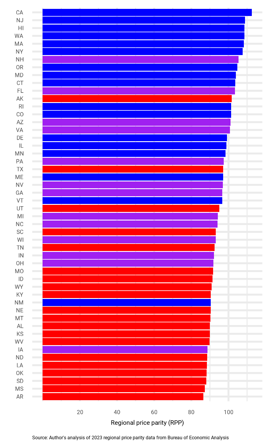
As Figure 1 demonstrates, as of 2023 (the latest year of data), there was a clear correlation between political leaning and overall price levels. The five most expensive states were blue states, and the five least expensive states were red states. The average RPP in blue states was 103, while the average RPP in red states was 91, and the average for purple states was 97. This indicates that the average blue state was 13% more expensive, overall, than the average red state.
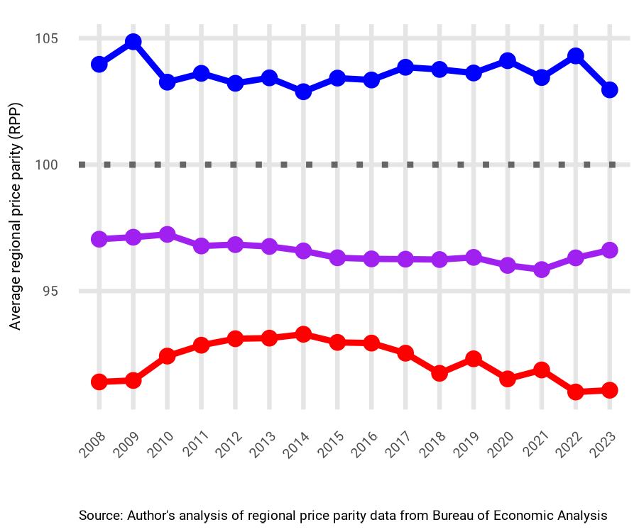
This is not a new development. Figure 2 traces the differences in price levels for blue, red, and purple states back to 2008, when the RPP was first compiled. We see a longstanding pattern of higher costs in blue states, and lower costs in red states.
What Drives Higher Costs in Blue States?
Why are blue states higher cost than red and purple states? We can gain some insight by comparing costs on different elements of the RPP: housing, utilities, goods, and services. Blue states are higher cost than purple and red states across each category. The differences, however, are much more dramatic for housing and utilities. For goods and services, as of 2023, blue states were only 7 percent and 6 percent, respectively, more costly than red states. For housing and utilities, this jumps up to 52 percent and 45 percent. And, according to the Bureau of Labor Statistics, housing and utilities account for about 33 percent of Americans’ total expenditures.5
Why do blue states have such higher-cost housing and utilities? With respect to utilities, we are not aware of analysis that provides a clear answer. Environmental regulations and policies promoting clean energy likely play a role, but we should note that these policies also can have significant benefits, including improving public health and promoting clean energy development. In addition, since people tend to spend a much higher percentage of income on housing than utilities, housing accounts for a much greater share of the overall cost-of-living gap between red and blue states than utilities.
When it comes to housing, the first thing to note about the red-blue cost divide is that a substantial portion is driven by variation in income and opportunities. Blue states are more likely than red states to have large metro areas that produce high incomes and strong housing demand. In 2023, the average blue state had a median household income of around $87,000, compared to around $69,000 in the average red state.
Large metro areas that generate agglomeration advantages for firms and workers are a huge benefit for blue states, and to the country as a whole. Indeed, throughout American history, people have migrated from poorer, more rural areas, to cities and suburbs to chase higher wages and greater opportunity. And throughout the greater part of the 20th century, the housing stock in high-opportunity metro areas expanded to accommodate this in-migration and keep housing costs from rising too quickly.
However, this process started to break down in the 1970s, as many localities increased barriers to housing development through zoning, parking requirements, onerous permitting processes, environmental regulations, historical preservation, and other mechanisms. This made it harder and more expensive to build, particularly in vibrant metro areas. Growth in the housing stock slowed, and shifted away from high-opportunity metro regions to lower-opportunity metro regions, suburbs, and exurban areas. This led to demand outstripping supply, and a dramatic growth in housing prices in high-opportunity metro regions.
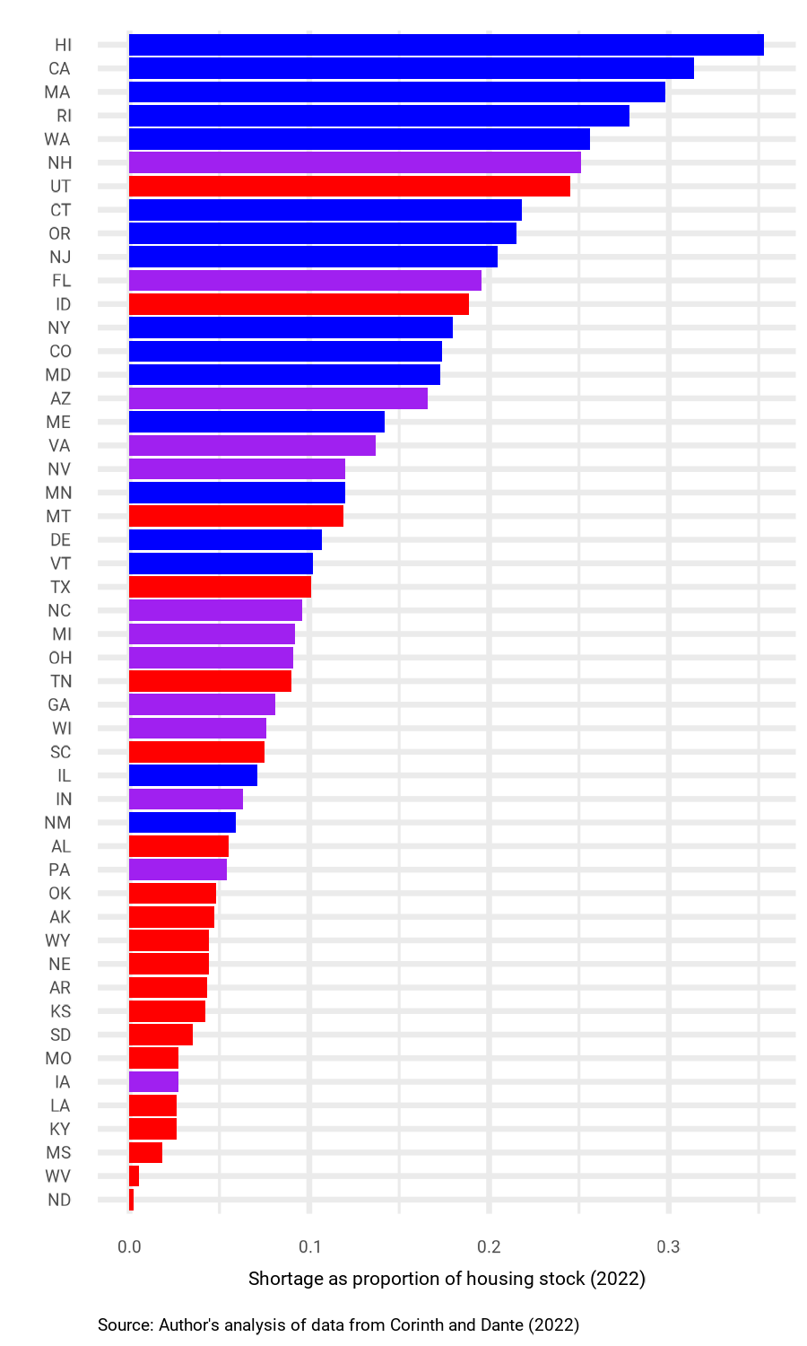
Regulations that restrict housing supply have persisted, and contributed to a shortage of housing that is more severe in blue states. In recent years, economists have sought to quantify the size of the U.S. housing shortage, and estimate how the shortage varies from region to region. In a recent paper, economists Kevin Corinth and Hugo Dante estimate the gap between the number of homes that exist, and the number that would have existed absent supply-constraining regulations.6 Using this method, they find a national housing shortage of 20.1 million homes in 2022. What is more interesting for our purposes is their estimates of the distribution of the shortage across red, purple, and blue states.
Figure 3 shows Corinth and Dante’s estimates of housing shortage as a percentage of existing housing stock by state, with states coded blue, purple, and red as discussed above. The figure demonstrates that blue states tend to have much greater housing shortages, with Hawaii and California topping the chart with shortages of over 30% of existing housing stock. According to these estimates, the average blue state, as of 2022, had a housing shortage of 19% of existing stock, compared to 11% in purple states, and 6% in red states.
Zoning and Blue State Costs
What accounts for the greater housing shortages in blue states, relative to purple and red states? Surely, the fact that many blue states contain high-opportunity, high-income metro areas with strong demand for housing plays a role. But, as we show here, the evidence also suggests that blue states tend to impose more onerous restrictions on building new housing than red and purple states, exacerbating shortages.
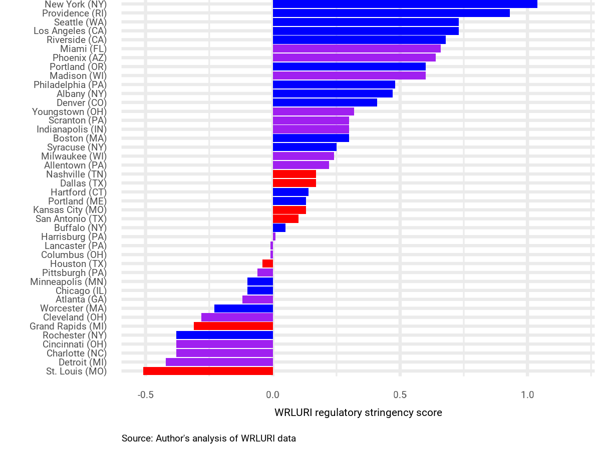
There is no comprehensive, jurisdiction-level source of data on housing regulations, but researchers have gone to great lengths to compile some of these data. The most comprehensive of such efforts is the Wharton Residential Land Use Regulatory Index (WRLURI). In 2018, researchers based at the Wharton School of the University of Pennsylvania surveyed local government officials in nearly 2,450 primarily suburban U.S. jurisdictions, and used survey results to score the stringency of housing production regulatory regimes.7 A high score indicates more restrictive regulations, and a low score indicates fewer restrictions. WRLURI scores are relative, with the national average set to 0, and standard deviation set to 1.
Since survey responses for jurisdictions are not randomly distributed across states, it is somewhat difficult to use these data to characterize regulatory regimes at the state level. However, for 43 metropolitan areas, there were at least 10 communities responding to the survey,8 so for these metropolitan areas we can get a basic idea of overall regulatory stringency. We took these 43 metro areas, and matched them to the state in which the majority of the population resides (some metro areas cross state lines). Then we examined whether there were systematic differences in regulatory stringency between red, purple, and blue states. As demonstrated below in Figure 4, even restricting to metro areas (which tend to be more restrictive across the board), blue states, on average, have significantly more stringent regulations on housing production than red and purple states.9
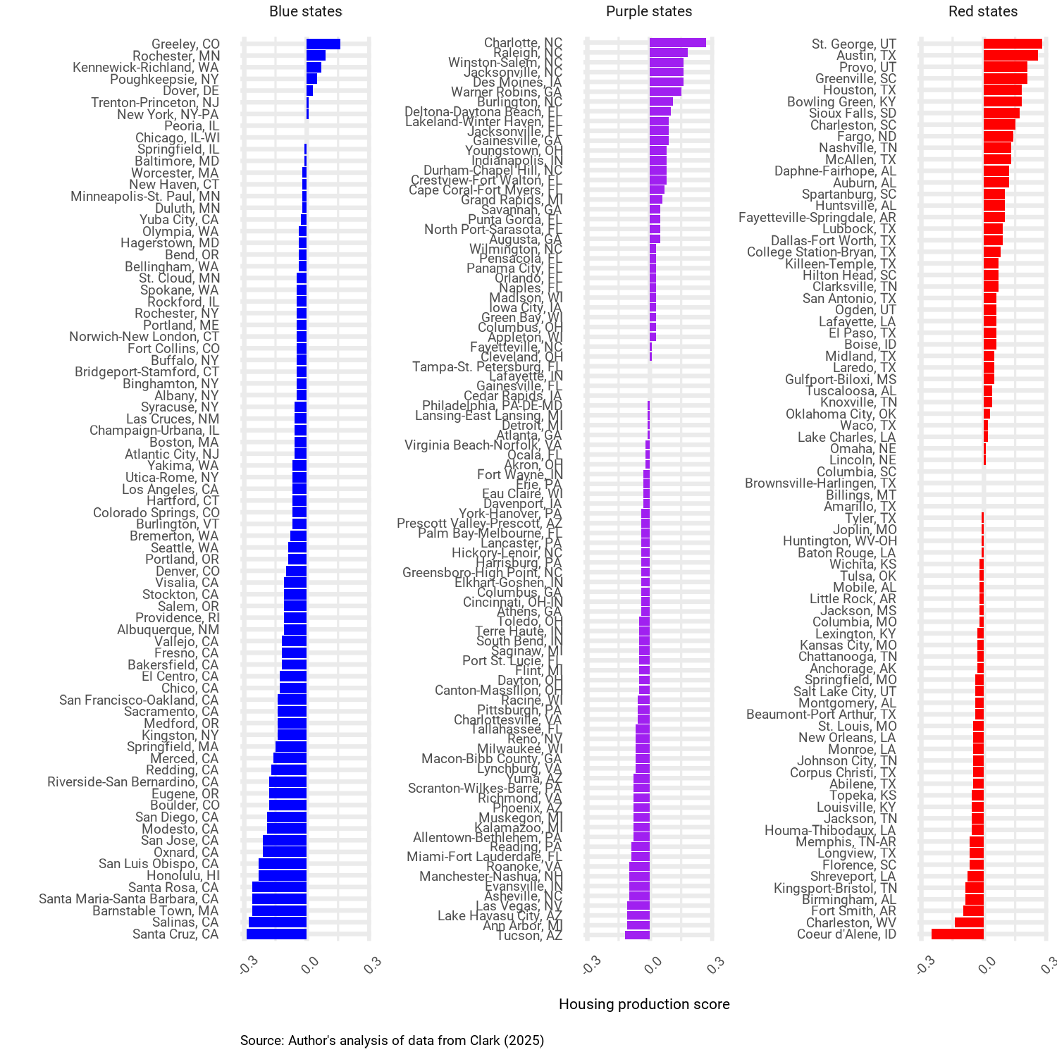
Another piece of recent analysis from economist J.H. Cullum Clark also speaks to the effect of regulations on housing production across red, purple, and blue states.10 For the 250 largest metro areas in the U.S. as of 2010, Clark brings together a wide array of demand-side and supply-side data (including physical constraints like mountainous terrain and coastlines) to estimate what housing growth between 2010 and 2023 would have looked like if all metro areas had similar land-use regulations.11 He then computes a housing production score as the difference between the amount of actual housing growth that occurred and the amount predicted by the model. A score of .1, for instance, indicates 10 percentage points greater growth than predicted by the model (e.g. a growth in the housing stock of 30 percent versus 20 percent), and a score of -.1 indicates 10 percentage points less growth than predicted.
The data tell a clear story. Metro areas in blue states generally added less housing than would be expected based on Clark’s model, with an average gap of 9 percentage points between expected and actual production. In contrast, the average metro area in a purple state added about what would be expected, and the average metro area in a red state added 2 percentage points more housing than expected based on the model. Why are blue states adding fewer units than would be expected based on levels of demand and other relevant factors? Similar to the WRLURI zoning data, these data indicate more stringent restrictions limiting the supply of housing in blue states compared to purple and red states.
Conclusion
The red-blue cost-of-living divide is stark. As of 2023, the average blue state was 13% more expensive than the average red state. Housing in the average blue state is 52% more expensive than in the average red state. This is driven in part by blue states’ higher incomes and high-opportunity metro areas. But it also reflects stricter regulations on the production of housing in blue states, which generate shortages. Overall, this analysis suggests a clear path forward for Democrats concerned about cost-of-living in the states and cities that they govern: make it easier to build housing in the places people want to live and work.
About the Author

Samuel Trachtman is a senior researcher at BESI, where he leads the Political Economy of California research program. The goal of the program is to produce research insights that help policymakers in state government to overcome political barriers and advance policies that mitigate California’s affordability problem. Trachtman received his Ph.D. in Political Science from UC Berkeley, and has published widely in journals including American Political Science Review, Energy Policy, Governance, Nature Energy, Public Opinion Quarterly, and Perspectives on Politics.
Notes
- See https://prospect.org/infrastructure/housing/2024-10-18-housing-blues/ and https://www.theatlantic.com/politics/archive/2024/11/democrat-states-population-stagnation/680641/ ↩︎
- See https://www.vox.com/politics/403364/tik-tok-young-voters-2024-election-democrats-david-shor ↩︎
- See, for instance, https://www.theguardian.com/us-news/2024/nov/24/democrats-harris-philadelphia-trump ↩︎
- We should note these data are not comprehensive: they exclude taxes, differences in the quality of goods, and unique local costs (like hurricane insurance in Florida), among other things. Details on the RPP measure can be found here: https://www.bea.gov/system/files/methodologies/Methodology-for-Regional-Price-Parities_0.pdf. ↩︎
- See https://www.bls.gov/news.release/cesan.nr0.htm? ↩︎
- Corinth, K., & Dante, H. (2022). The understated “housing shortage” in the United States (IZA Discussion Paper No. 15447). Institute of Labor Economics (IZA). https://www.iza.org/publications/dp/15447/the-understated-housing-shortage-in-the-united-states/ ↩︎
- Gyourko, J., Hartley, J., & Krimmel, J. (2021). The local residential land use regulatory environment across U.S. housing markets: Evidence from a new Wharton index. Journal of Urban Economics, 124, 103337. https://doi.org/10.1016/j.jue.2021.103337 ↩︎
- We excluded Washington, DC. ↩︎
- Metro areas in blue states had a mean WRLURI score of .4, compared to .1 for metro areas in purple states, and -.04 for metro areas in red states. ↩︎
- Clark, J. H. C. (2025, April 9). Build homes, expand opportunity: Lessons from America’s fastest-growing cities. George W. Bush Institute–SMU Economic Growth Initiative. https://www.bushcenter.org/publications/build-homes-expand-opportunity ↩︎
- We removed outliers Myrtle Beach, SC and Salisbury, MD. ↩︎